CSS and Images: An Overview
Without a clear understanding of exactly what’s going on when we apply CSS width, height, and position properties, it can be difficult to make elements appear the way we want them to. Images are no exception. Let’s take a comprehensive look at HTML <img> elements and how we can control their behavior.
HTML image elements are replaced elements. That means their size and appearance are determined indepently of CSS. These elements have intrinsic properties that determine how they are displayed. If you insert an <img> tag into a web page without giving it a set height and width, the space it occupies is dictated by its inherent attributes.
As developers, this is rarely what we need. We usually need to make sure this image stays inside of a container or changes size when viewed on different devices. Specifying the image’s height or width is a good starting point for controlling how much space it takes up. If we place an <img> tag on the page and use CSS give it a height of 200px, the image will appear 200px tall, holding proportions constant. Take the following example:
<img class="sneetches" src="/sneetches.jpg" alt="sneetches">.sneetches {
height: 200px;
}The above code generates the following:
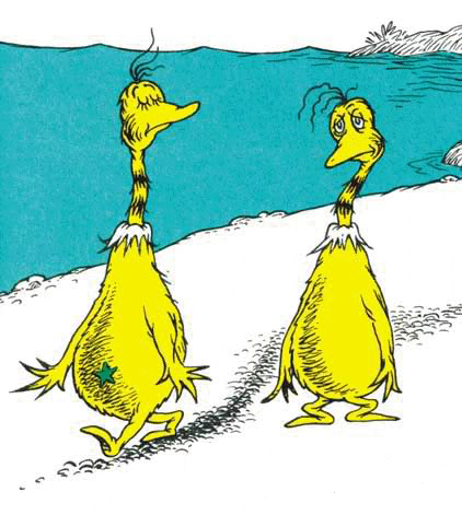
The image of the Sneetches (from “The Sneetches and Other Stories” by Dr. Suess) has intrinsic dimensions of 422x471 pixels. Since we gave it a height of 200px but did not set width, CSS sets height to 200px but keeps the width set to its inital value of auto so the original proportions of the image are maintained. If we instead gave it a width property and no height, CSS would keep height at auto and scale the image proportionally to meet the width we set.
If we set both height and width, proportions will not be maintained and the image will stretch to meet our dimensions:
.sneetches {
  height: 200px;
  width: 300px;
}
That is funny looking! Usually we want to maintain the proportions of our images so we would set height or width and not both.
One drawback of setting these properties using pixels is that, when viewed on devices of different sizes, the image does not scale to fit the device. An image with a width of 800px will get cut off on a device with a screen width of 375px. Though we can write media queries to adjust the size for different devices, we can also express the width and height of an image as a percentage.
Percentage Height and Width
When we use percentages to set the dimensions of an image, it is important to realize what that percentage refers to. A percentage width or height does not refer to the intrinsic dimensions of the image. It refers to the containing block of the <img> element on the DOM. An element’s containing block is an important concept in CSS, so if it doesn’t sound familiar be sure to read up on it. This link provides a clear explanation. In short, if an element’s position is static (the default) or relative, its containing block is the nearest block-level parent element. If the element’s position is not static or relative, its containing block is the nearest parent whose position is absolute, fixed, or relative.
If we just throw an image onto our HTML document at the root level, its containing block is the viewport. If we give it a percentage width, the percentage will be in reference to the width of the viewport. If we give the image a width of 50%, it will always take up half of the entire screen, holding proportions constant. If we put the image inside a container div, set its width to 220px, and give the image a width of 50%, it will take up half of the containing div’s width (110px):
<div class="sneetch-container">
  <img class="sneetches" src="/sneetches.jpg" alt="sneetches">
</div>
.sneetch-container {
margin: 0 auto; /* center the div */
background-color: red;
width: 240px; /* set div width to 240px */
}
.sneetches {
width: 50%; /* set image width to 50% */
}As you can see, the image takes up half of the containing div. Since the container’s width is fixed at 240px, this is effectively fixing the image’s width at 110px. Usually, we use percentage widths so that elements will adapt to different screen sizes. We can achieve that in this example by setting the containing div’s width to 50%:
.sneetch-container {
  ...
  width: 50%; /* set div width to 50% */
}
.sneetches {
  width: 50%; /* set image width to 50% */
}
Now, when we resize the browser, the container div and the image within are responsive, always taking up 50% of their respective containing blocks.
Percentage Height
Setting a percentage is, well…weird. Unless the target element’s containing block has an explicitly defined height, percentage heights can behave unexpectedly. If the containing block’s height is dependent on its content (not explicitly defined) and its position is not absolute, CSS will ignore the height we set and set it to auto. Therefore, using percent width is preferred as it gives us greater control.
Containing Images and the Overflow Property
Container divs typically do a great job of stretching to contain their content. However, when we start setting explicit heights, using floats, or messing with positioning, images can creep out of their containers. For example, we can’t define a height on the parent container and just expect the image to respect its authority:
.sneetch-container {
  height: 200px;
  background-color: green;
}
As you can see, the Sneetches extend beyond the borders of their parent. Of course, we could add restrictions to the image (i.e. height: 200px) to keep it within the parent or modify the parent to be large enough to accommodate the image. Alternatively, we can manipulate the overflow property of the container. Initially set to visible, overflow allows replaced elements like images to bleed out of their containers. Setting overflow to scroll will clip the extraneous content and add scroll bars to enable viewing. Setting overflow to hidden clips the content without scroll bars:
.sneetch-container {
  height: 200px;
}
Overflow auto can come in handy when we put a float on our images. In the following example we are floating the image to the left to make room for text on the right. We also want to give the container a background color and padding:
<div class="sneetch-container">
  <img class="sneetches" src="/sneetches.jpg" alt="sneetches">
  <p>Now, the Star-Belly Sneetches</p>
  <p>Had bellies with stars.</p>
  <p>The Plain-Belly Sneetches</p>
  <p>Had none upon thars.</p>
</div>
.sneetch-container {
padding: 10px;
background-color: #CDE5F4;
}
.sneetches {
margin-right: 10px;
float: left;
}
p {
font-size: 20px;
}
p:first-of-type::first-letter {
font-size: 45px;
}Now, the Star-Belly Sneetches
Had bellies with stars.
The Plain-Belly Sneetches
Had none upon thars.
Though that looks pretty good, we need to make sure that the container div encapsulates the image so that the color reaches below and the content that follows doesn’t get sucked up to the right of the image because of the float. All we need to do is add overflow: auto; to the container:
.sneetch-container {
  ...
  overflow: auto;
}
Now, the Star-Belly Sneetches
Had bellies with stars.
The Plain-Belly Sneetches
Had none upon thars.
Max-width
Lastly, let’s take a look at some nifty settings that we can use to customize our image displays. By setting max-width instead of width, we can put an upper bound on the width of the image. This is particularly useful for responsive designs when we want an image to scale to fit any device while never exceeding the max-width we set. Consider the following:
<div class="sneetch-container">
  <img class="sneetches" src="/sneetches.jpg" alt="sneetches">
</div>
.sneetch-container {
background-color: #CDE5F4;
text-align: center;
padding: 10px;
}
.sneetches {
max-width: 80%;
}That way, on large devices, the photo will not be enlarged beyond its inherent dimensions and, when viewed on small devices, will never exceed 80% of the width of its container because of max width. Resize the browser and give it a try!
Suppose we wanted to create space on a page for displaying a variety of images, one at a time. Our images are of different sizes - some tall and skinny, others short and wide. We want to display them one at a time, but leave room for all of them to come and go without affecting the surrounding content. This can be achieved using a combination of max-width and max-height:
<div class="sneetch-container">
<img class="sneetches active" src="/sneetches.jpg" alt="sneetches">
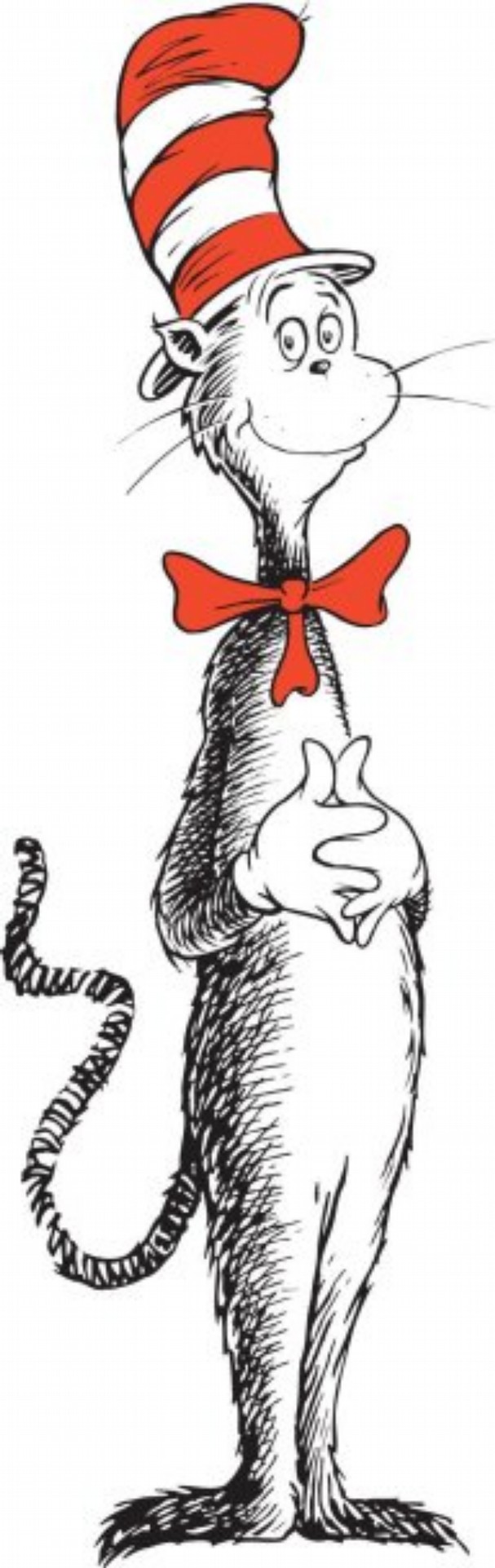
<img class="sneetches" src="/catinthehat.jpg" alt="cat in the hat">
<img class="sneetches" src="/sneetches2.jpg" alt="sneetches 2">
</div>.sneetch-container {
height: 200px;
padding: 10px;
background-color: #CDE5F4;
display: flex;
justify-content: center;
align-items: center;
}
.sneetches {
display: none;
max-width: 85%;
max-height: 180px;
}
.sneetches.active {
display: inline-block;
}And jQuery to hide and show the images:
var currentIndex = 0,
    numImages = $(".image-container img").length,
    $currentImage,
    $nextImage;

setInterval(cycleImages, 2000);

function cycleImages () {
  $currentImage = $("img.active");
  if (currentIndex === numImages - 1) {
    currentIndex = 0;
    $nextImage = $("img").first();
  } else {
    currentIndex++;
    $nextImage = $currentImage.next();
  }
  $(".active").removeClass("active");
  $nextImage.addClass("active");
}
Gives us:
Pretty cool! Using the handy combo of height and max-width we get a window that can accommodate any size image and, by using a percentage for max-width, the window scales to fit any size device.
For futher learning check out the following CSS properties:
The following properties are under construction (I hope they become stable soon!):
And references for the properties discussed here: